“50 shades of blue” or how I approach a design system.
story.
Back in 2015, coming from mostly agency experience to the gambling giant William Hill, I wasn’t quite prepared or rather sure about what to expect from the projects in terms of creativity & processes. The dynamic was completely different and the environment was not what I was used to. Not to mention the struggle of relocating to another country, coming from Bulgaria to Spain/Gibraltar, and building a whole new life.
problem.
As opposed to agencies where you face a different creative challenge on a regular basis, I had to work on new pages & features of the same website & apps, improving and iterating on user journeys and all had to be done using the existing & consistent UI.
The issue was, the UI wasn’t always consistent at all. On one hand, multiple designers were working on different parts of the site. Each one of them wanted to innovate and no one was following any common patterns. On the other hand, existing issues with handing over designs to engineers created even more inconsistencies as they were lacking a clear reference and each time were building from scratch. Rarely reusing what other teams have done.
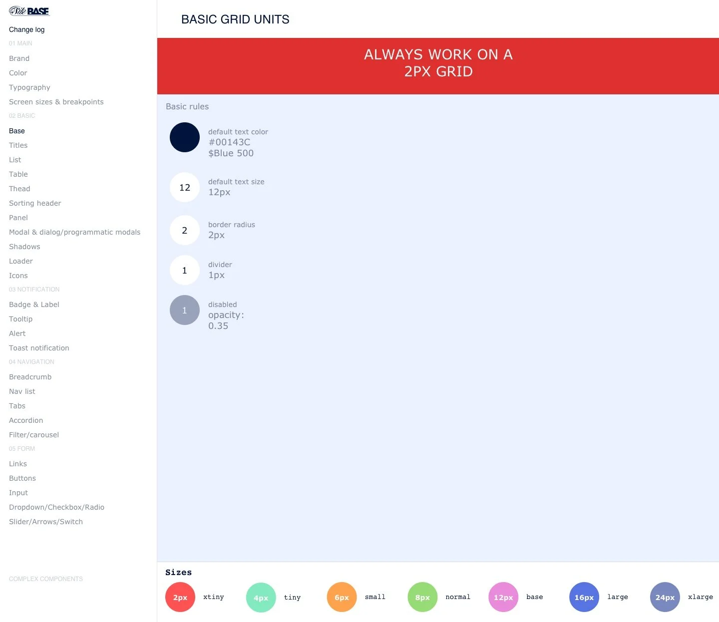
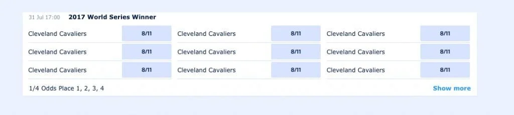
There were instances when we would use different fonts, colors, not to mention completely dissimilar components. The situation has gotten so out of hand so quickly that we would joke about the product’s new codename – “50 shades of blue”. It became apparent we need definitive & clear guidelines.
role.
My role & responsibilities grew with time. To begin with, I was given the difficult task of reviewing the website and applications and map irregularities as well as follow up on projects currently in design and work with my colleagues on ensuring an identical look & feel throughout the product. And over time this turned into me building consistency by devising a Design System, maintaining it, and coming up with strategies and processes of updating it.
To do this I had to work closely with the design team, onboard and educate newcomers on the usage of the design system and how to maintain it. Collaborate closely with engineering & architecture to build live components which we can reuse during development. But also earn buy-in from the business.
process.
So I started by gathering everything we were currently using in one place and looking into:
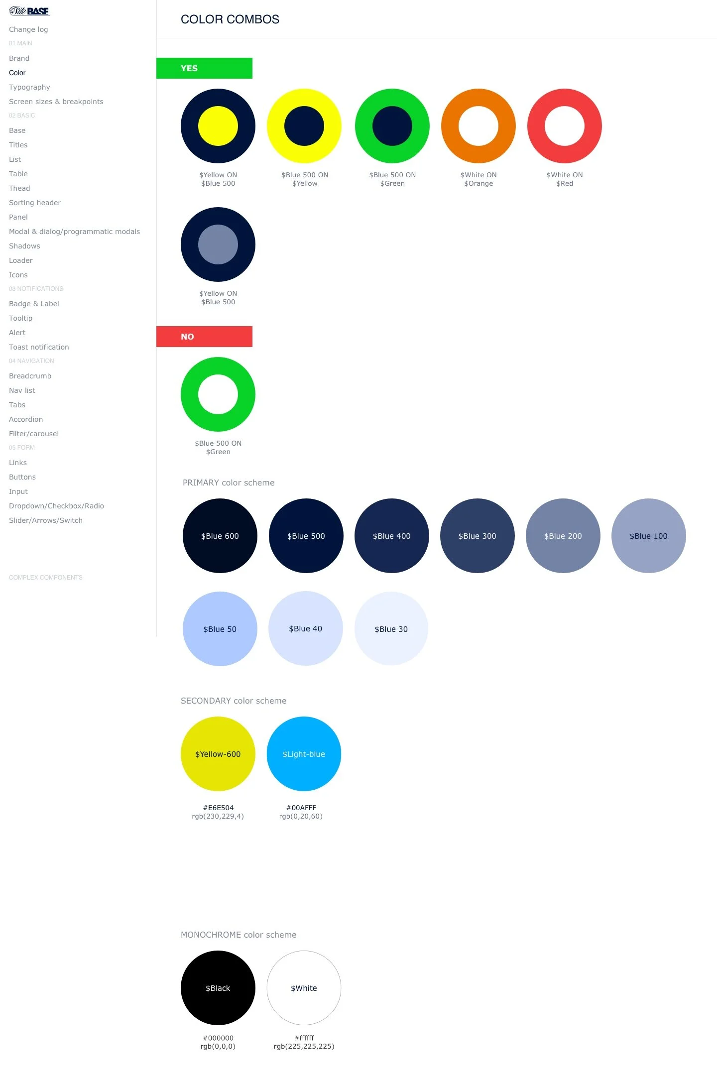
Reducing the number of colors and coming up with a clear brand presence. There was a brand book that apparently no one in the Product Design team was using or even knew where I can find
Collating all components used and coming up with a single solution where there were multiple somewhat similar-looking ones
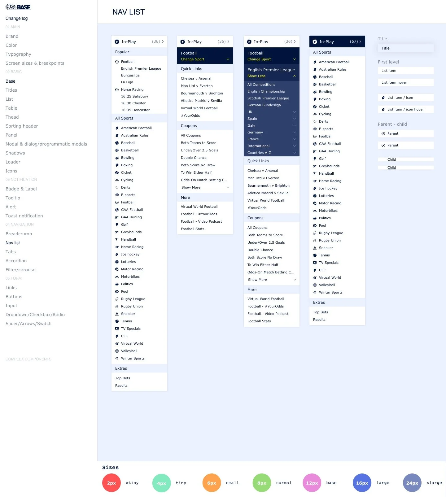
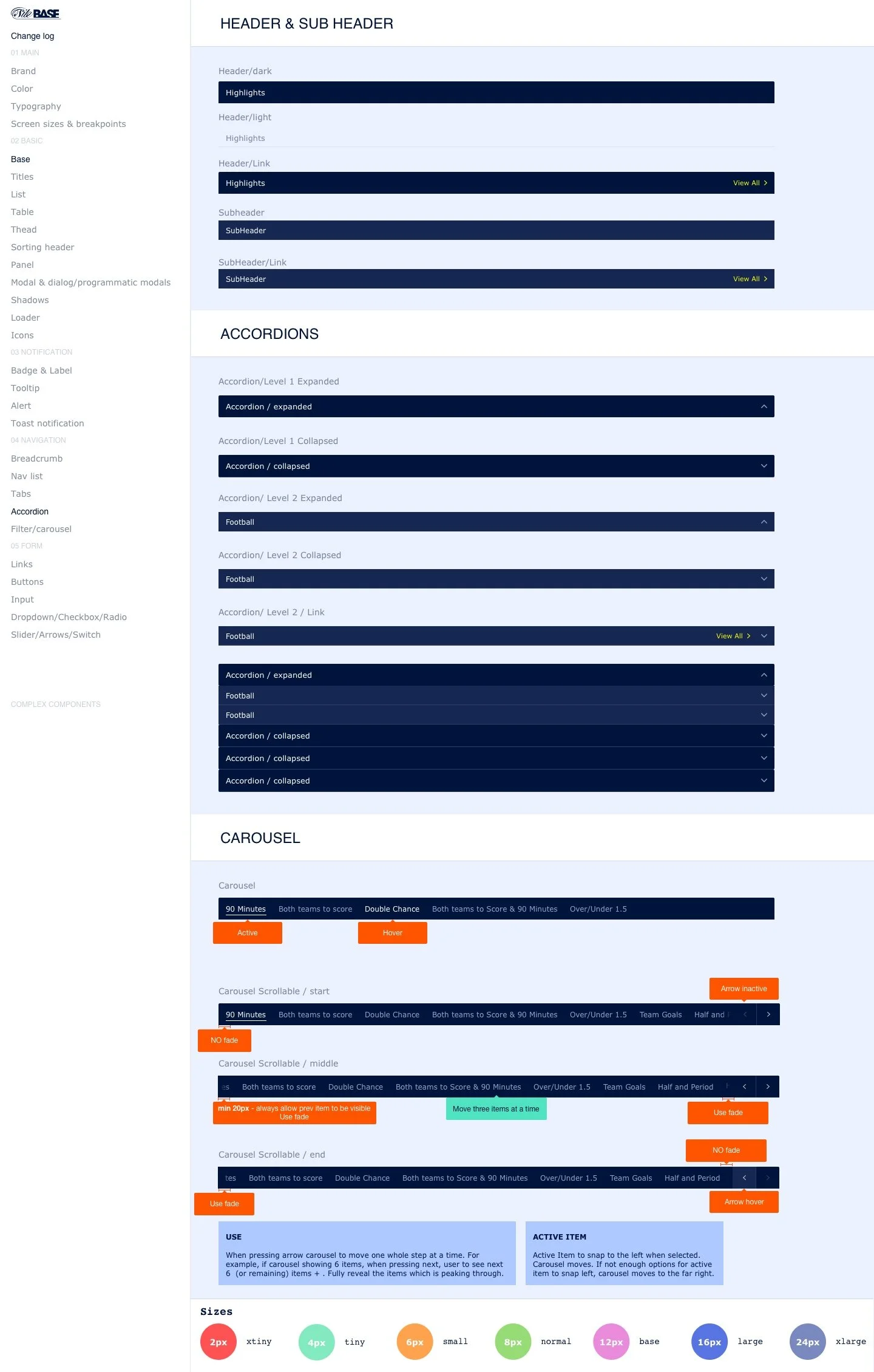
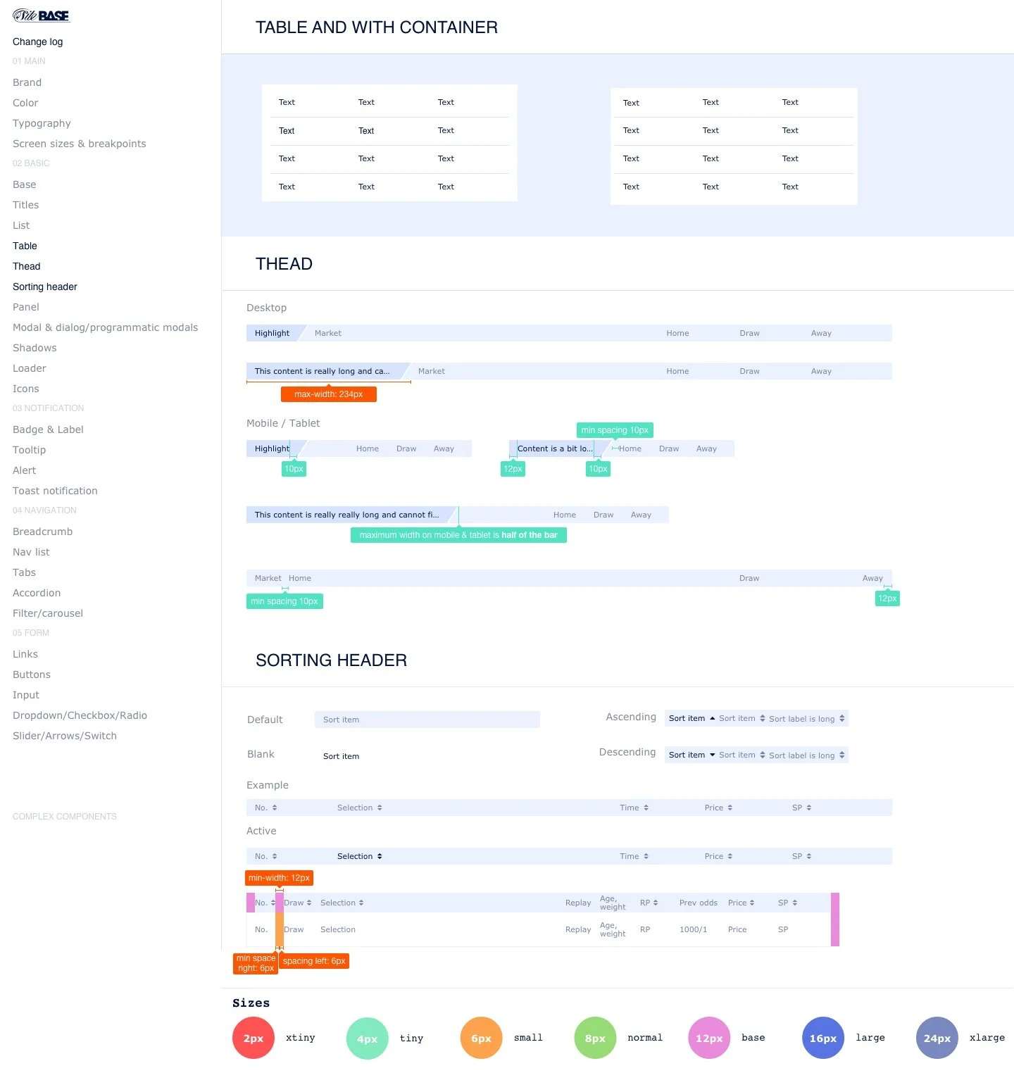
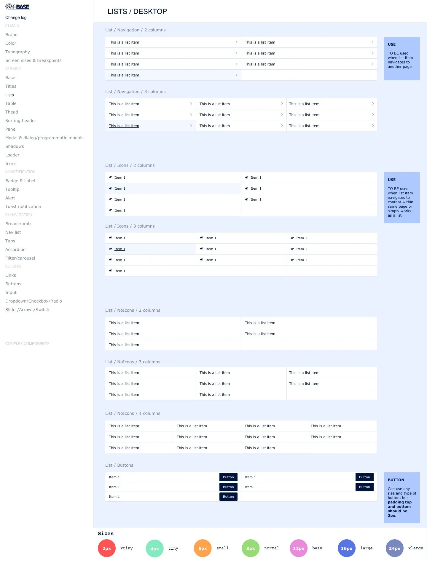
Building, what started as a UI kit, to be reused by designers at first and then scale to a reference point for everyone across the organization

challenges.
Getting everyone on board with using a style guide was not an easy task.
For some product designers in our team, a design system meant too many rules which limited their creativity. UI engineers were part of our team, but there seemed to be no communication or collaboration. Everyone was doing their own thing.
With that in mind, I decided to start somewhere. I spent the majority of my time digging through the product (often with the browser inspector), pulling designers and engineers aside to make sense of the mess I was looking at.
Then came yet another challenge, which proved to be the most difficult of them all and that was persuading the business that we need allocated resources of designers, UI, and back-end developers to build a live pattern library of reusable components which we were hoping to expand to the 7 or 8 product verticals we had such as Sportsbook, Casino, Bingo, etc. Nobody was interested in the color of the buttons if we were still making money.
OKRs.
My role was to prepare & organize a series of presentations to the business in the hope of convincing them to allocate the resources needed and invest in what would essentially be a huge bonus for the products. We went to them pitching that investing time and resource in a live pattern library would:
Decrease design production time by 40%
Decrease delivery time by 40%
Achieve consistency across the site
Improve the content structure & ensure easier discoverability of markets, potentially leading to more placed bets
beginning.
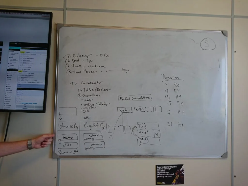
Still in Photoshop land, after my initial review, things were starting to look a bit like that. Loads of colors with no apparent reason as to why they are different. And the issues were not only with color but inconsistent and uneven spacing. My role was to work on the new structure and pass it on in the form of a guide we should use.


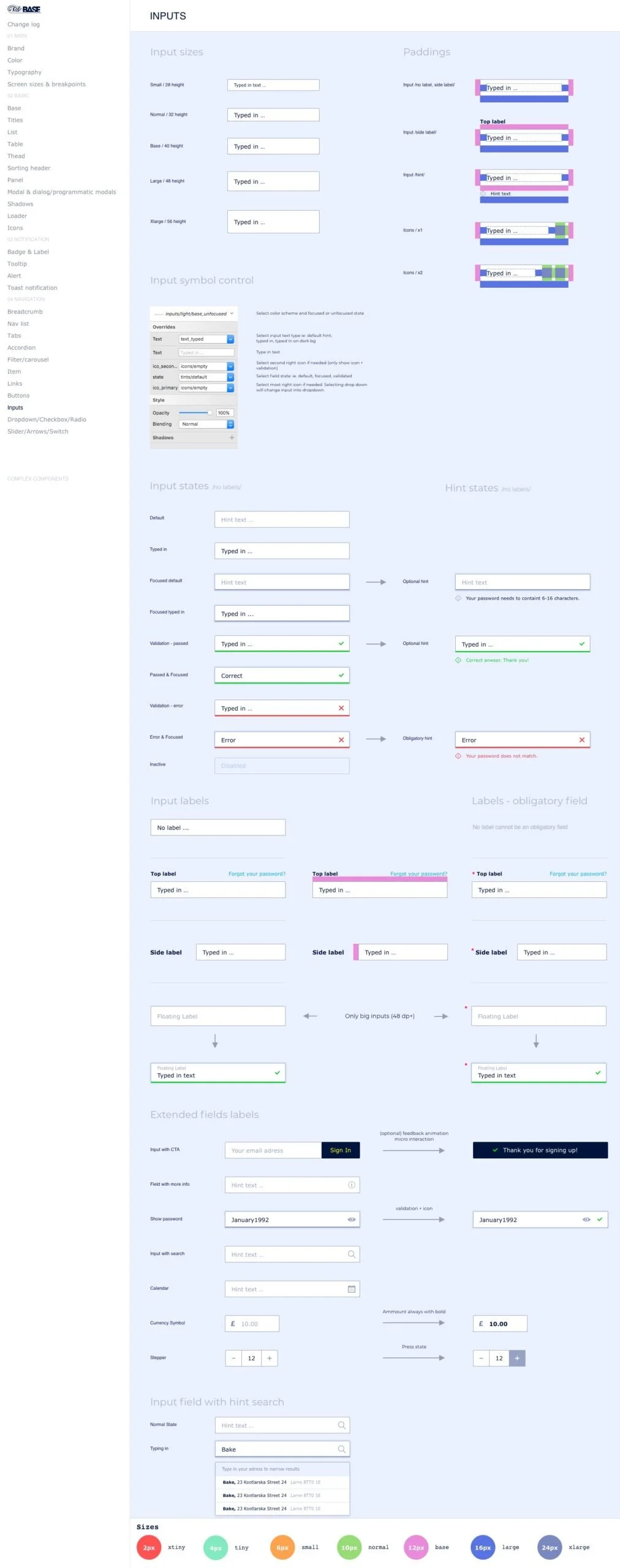
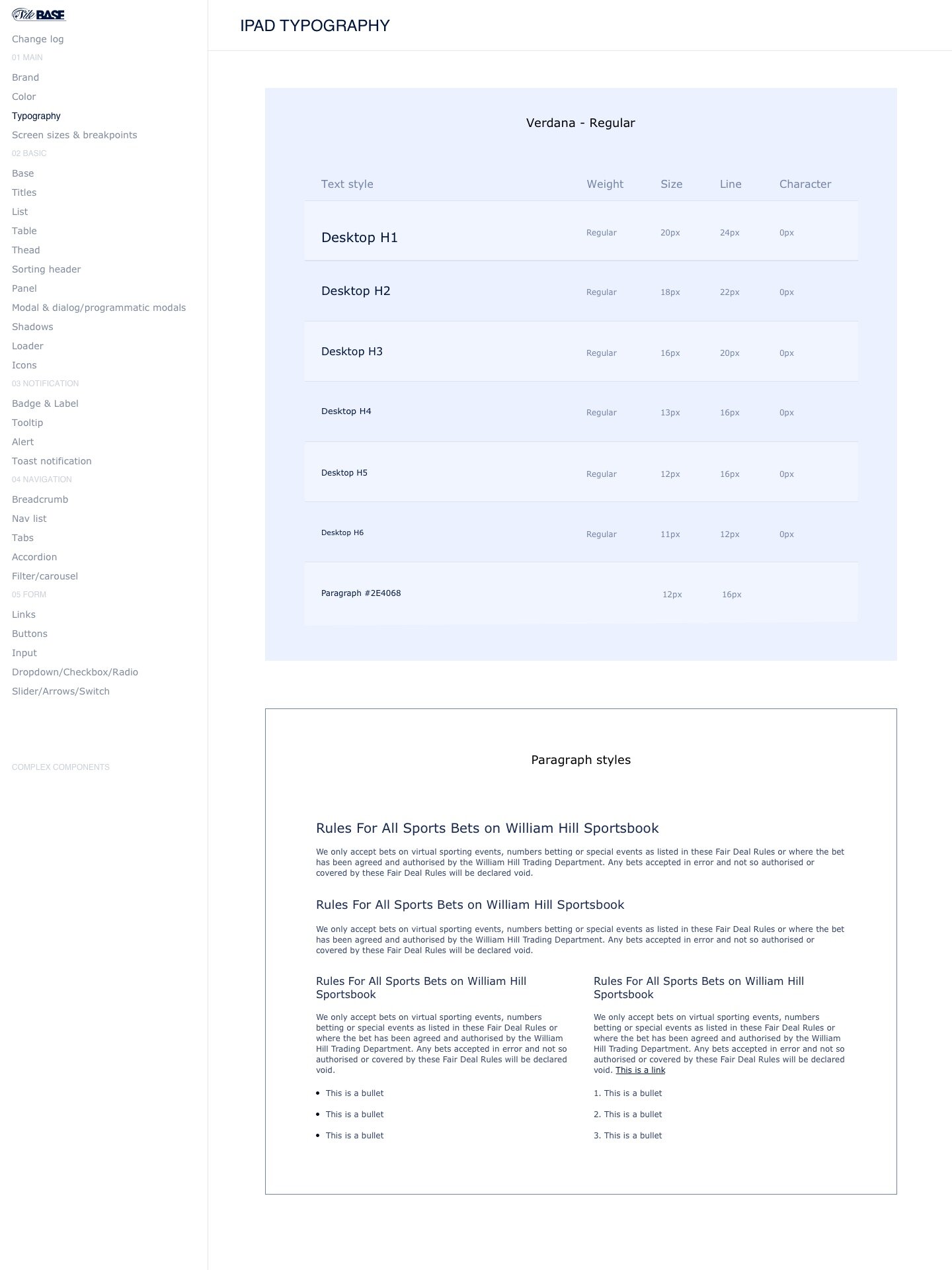
design system.
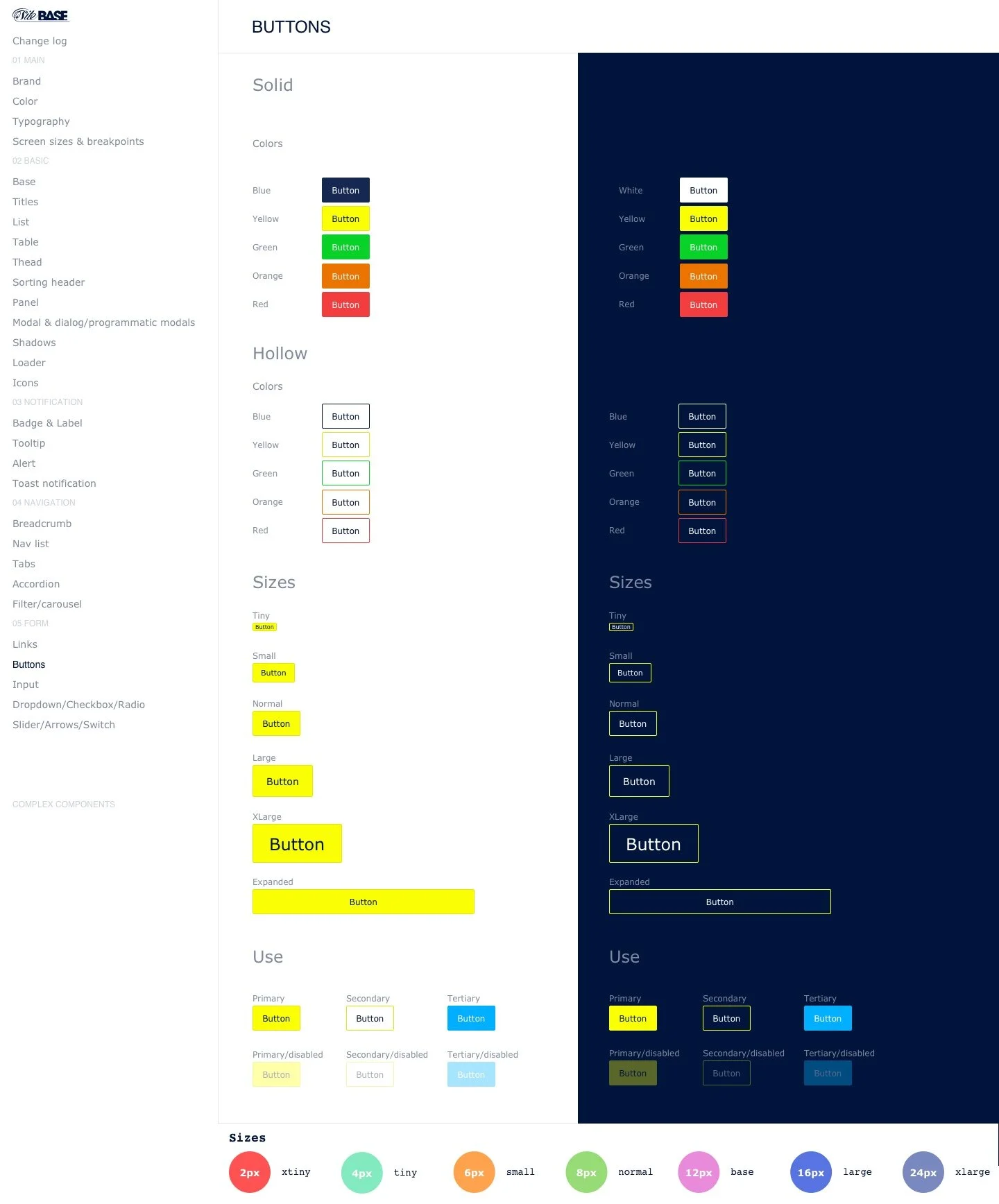
We had switched from Photoshop to Sketch. There were plenty of tools we could now work with such as Craft, inVision, Sympli.
We found inspiration in Foundation, Bootstrap, Material guidelines, Atomic design, etc in regards to the structure of the guide, the information we needed to include, even down to naming conventions we should use, etc.
I conducted a series of workshops, along with the engineers and my manager, to get the ball rolling, set up processes, and figure out the mechanics of it all. But most importantly keep the conversation fresh and get everyone on the same page. We started by implementing it to the most complex product – Sportsbook with the idea to roll it out to other verticals.
rebrand.
We were moving along well. We had a plan. All of a sudden the company decided to do a rebrand. We were working with a UK based agency to come up with the new look and feel of the brand and, more relevant to me, how it will be applied to the Sportsbook product.
The good news was, by having a semi-working pattern library in Sketch, helped us immensely to adopt the new brand.
progress.
With a long and bumpy road behind us & a rebrand, there was eventually a team of front and back end engineers dedicated solely to developing the pattern library. Designers were (more or less ) on board and using the guide.


process.
It was not all rainbows and butterflies yet. We were a long way to go to developing a fully-functioning, well-oiled design system. The main issue now was updating and sustaining it. After a few trial and errors we came up with the following process:
updating existing components.
Agreement on new components on a Product design level
Getting components signed off by UI, business, and product with dev being made aware of the changes as well
Specking the new components by the UI design team
Creating a new version of the UI kit with a log of all the changes
Get estimates on delivery from Engineering
Product designer – UI Engineer handover
Design working with Engineering, Project Managers, and Scrum Masters to ensure development.

creating new components.
Aligning UI and Product roadmaps
Following pattern library basics and consistency
Defining the components – naming conventions, global components, and/or sportsbook specific, etc.
Signing off designs
Specking
UI kit and log creation
Allocating into sprints

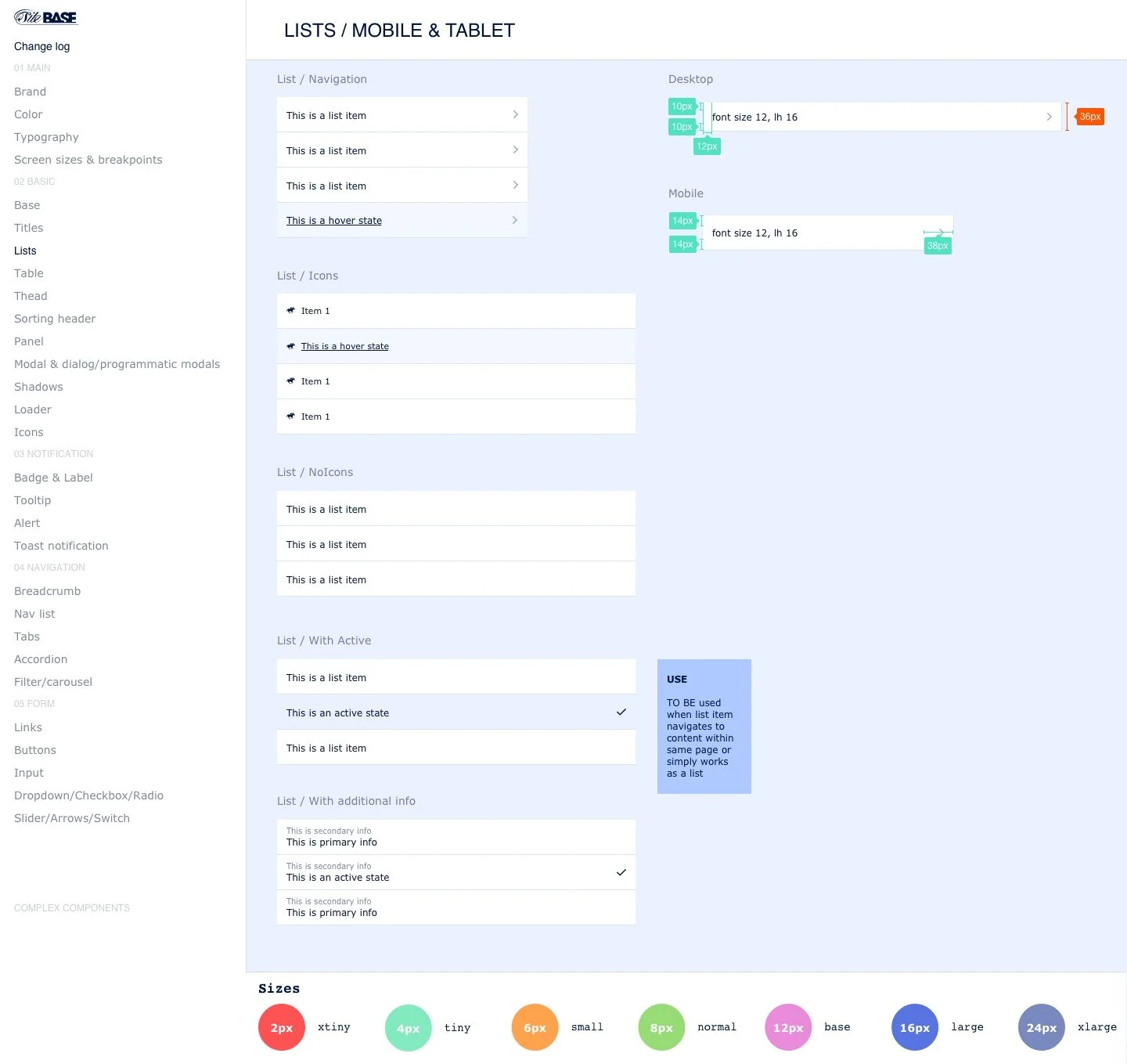
adaptive vs responsive.
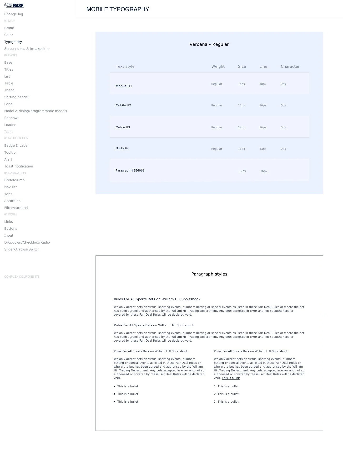
A few years before I joined it had all started as a responsive site and as things started to come together, we decided we need to move on to an adaptive approach. Seeing more and more touch devices, convertible and 2-in-1 laptops, phablets, etc. it was tough to maintain consistency across different platforms and operating systems.

Working on a responsive website is always challenging. Switching from responsive to adaptive on an already developed and quite a content-heavy site is definitely not an easy task.
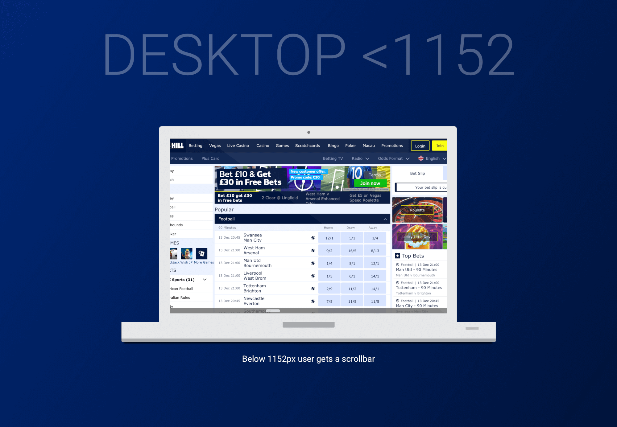
problem.
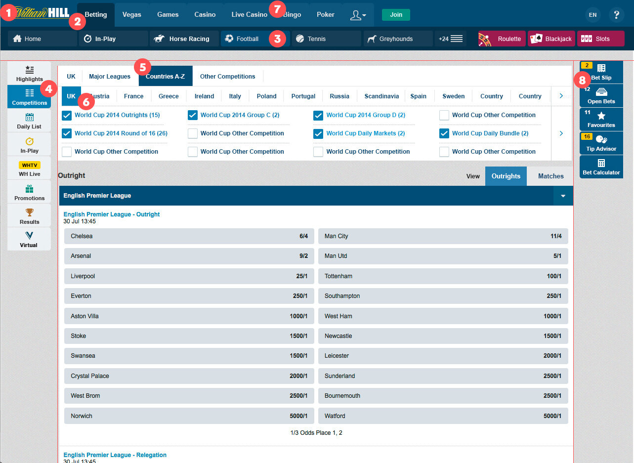
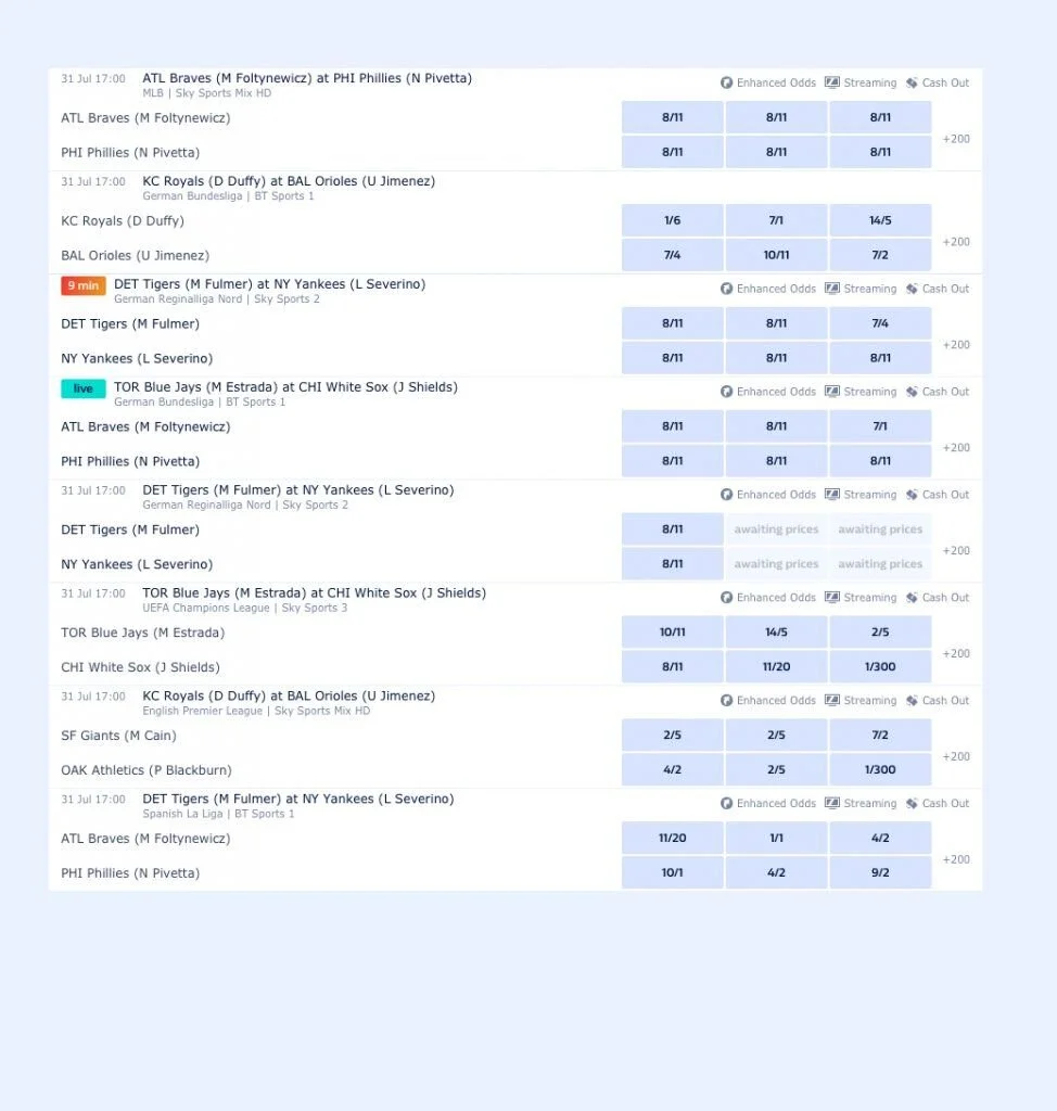
The desktop site was a stretched-out version of the mobile.
We were serving mobile content onto desktop screens and it did not look pretty. Moreover, desktop users were struggling to find the markets they were looking to bet on due to the content being too stretched out and not at all optimized for their screens.
It was crystal clear the website had to adapt in order to serve better-organized content.
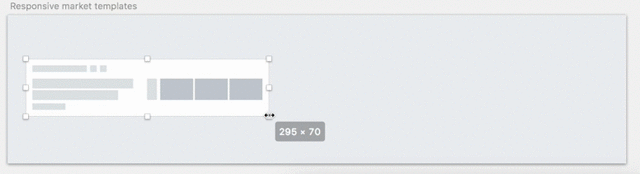
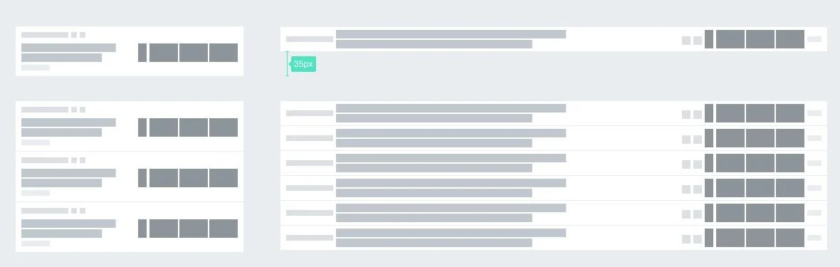
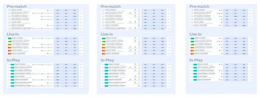
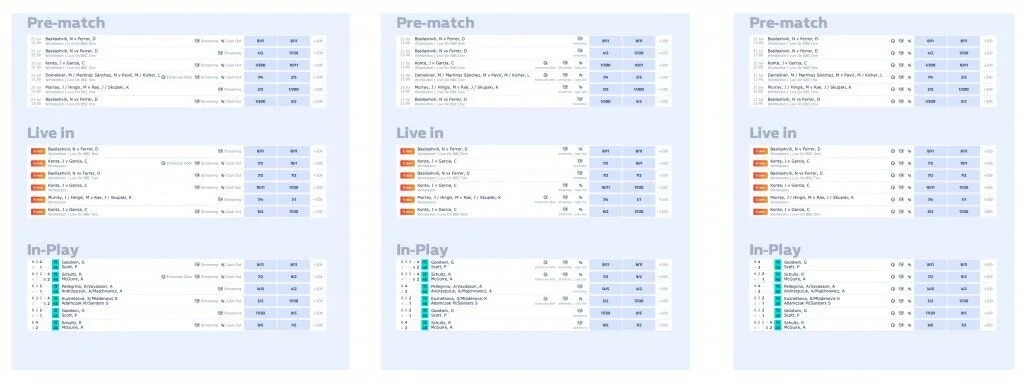
Looking at the data, we found out users did not seem to scroll much on the page and going any further than the “fold”. So it was an absolute must to look into content density and try to fit more information above the fold. After all, if users could easily get to the markets they wanted to bet on, it meant they would place more bets on our platform.
my role.
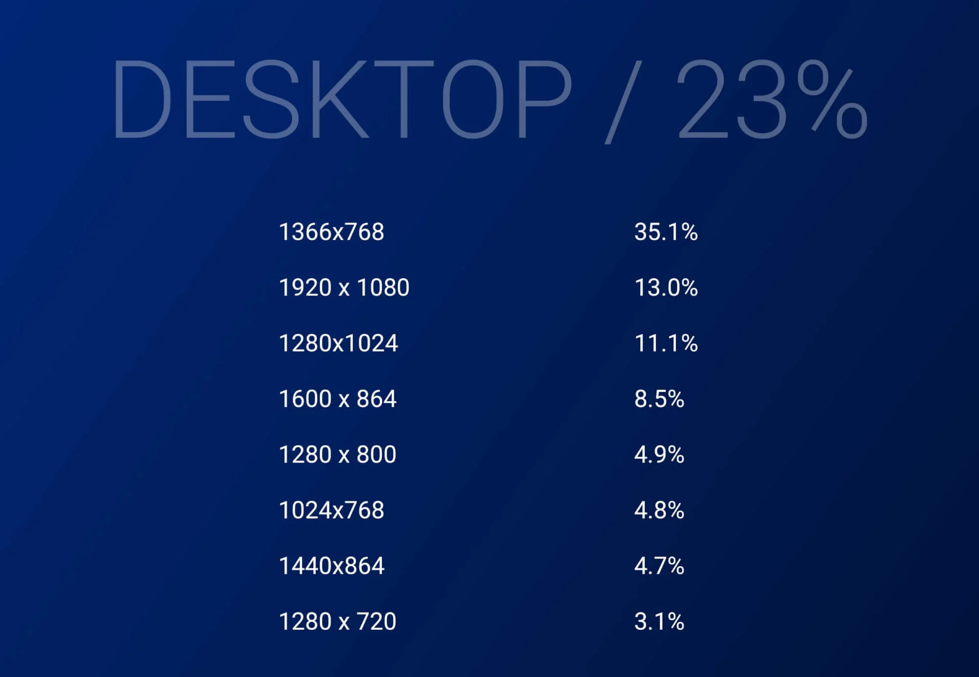
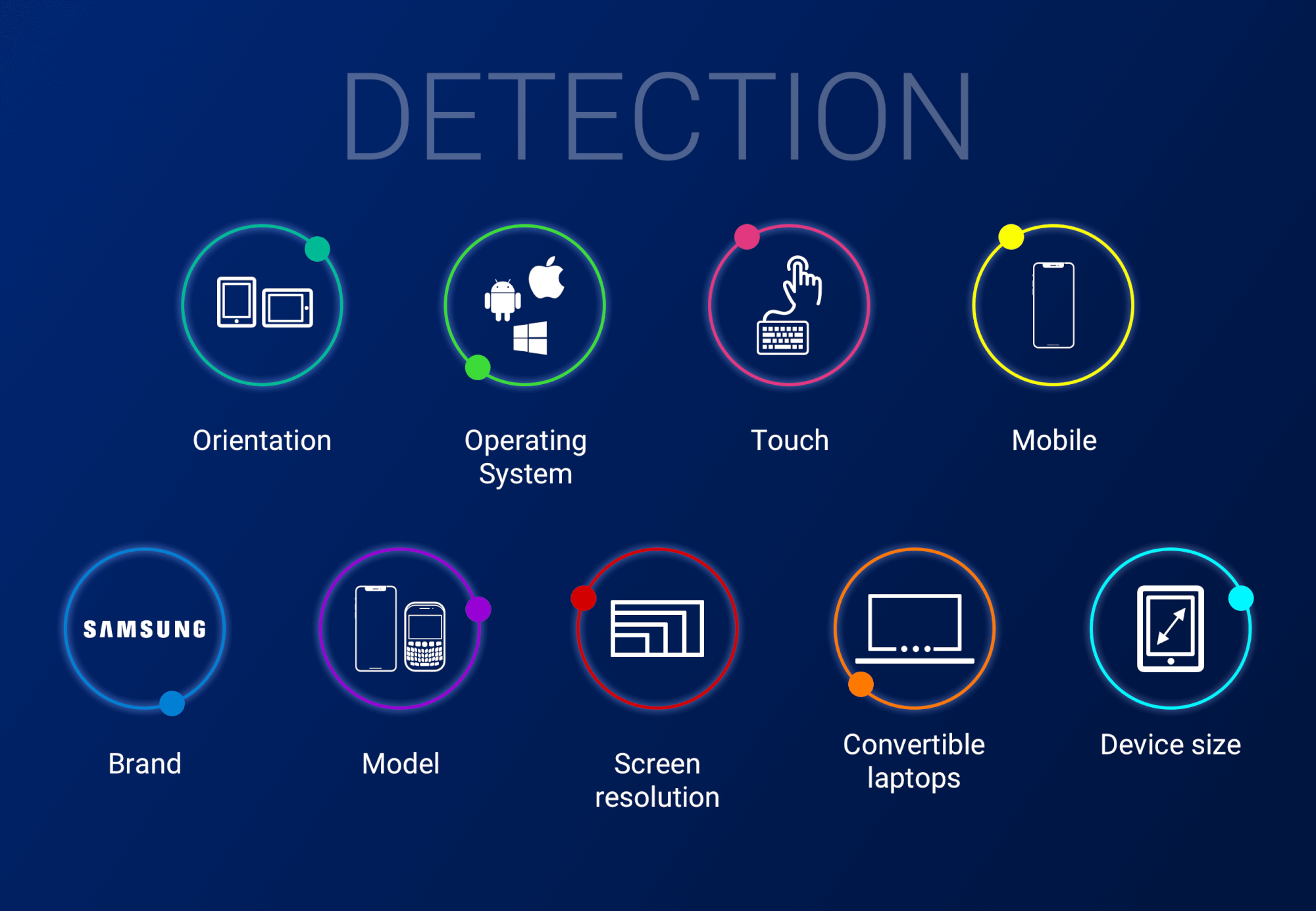
Conduct a thorough analysis of the devices and screen resolution our users were on. We also had to take into consideration touch, screen orientations, 2-in-1s and convertible laptops.
Working with the data and architecture teams I had to get information on devices our users were on, understand, using what parameters, we could target these devices & address specific issues with the experience so I could come up with the right “breakpoints” and best layout for them.

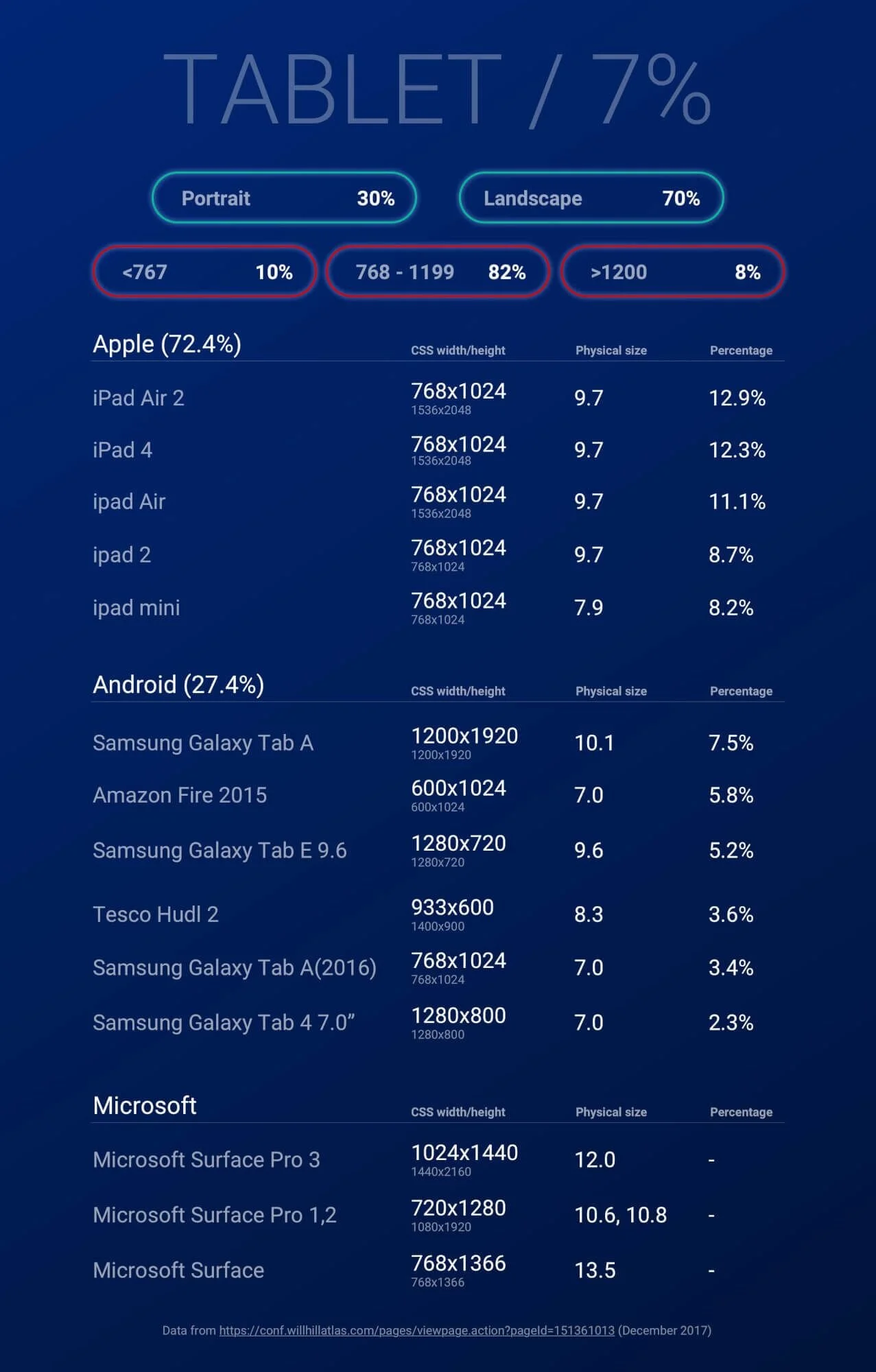

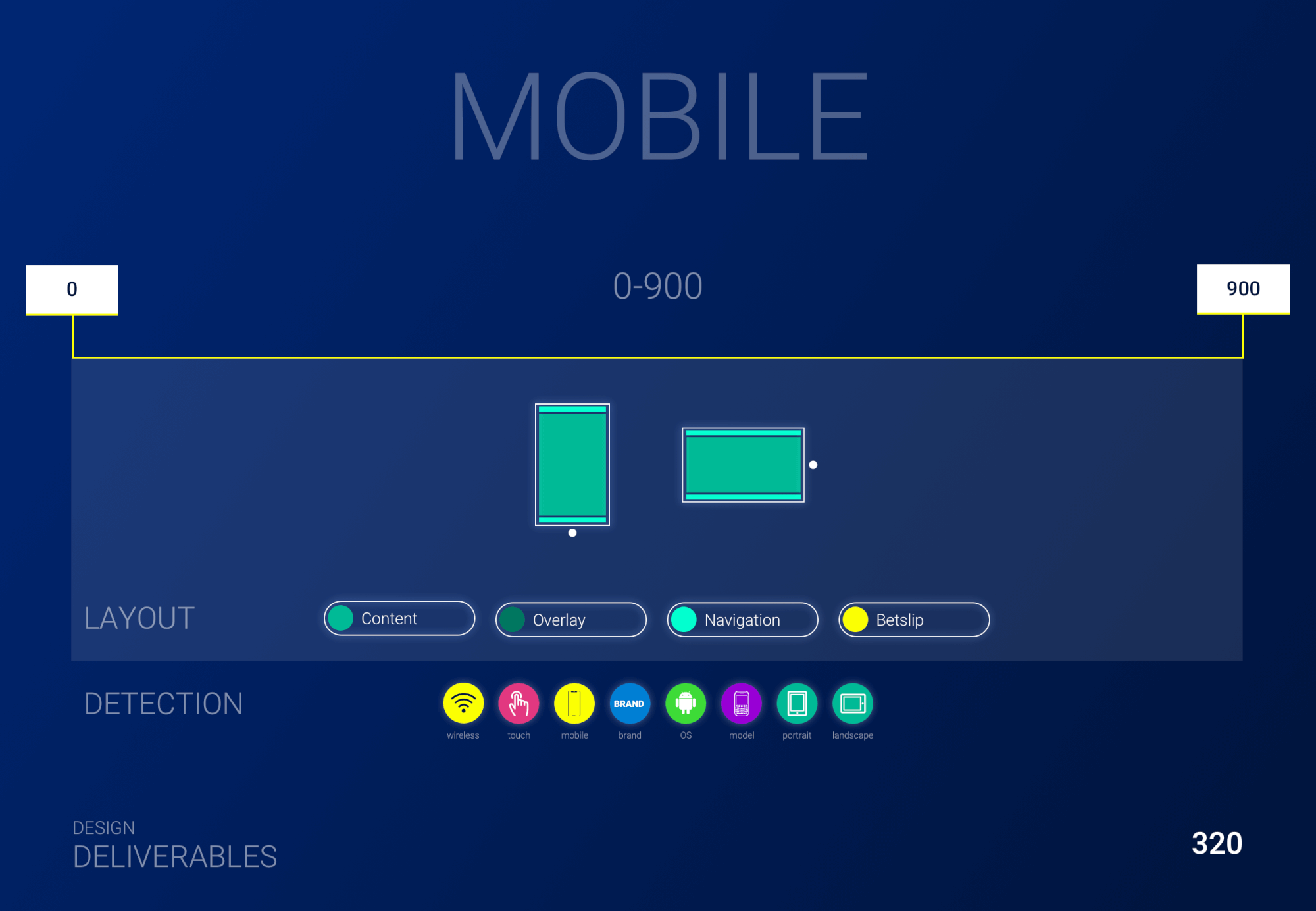

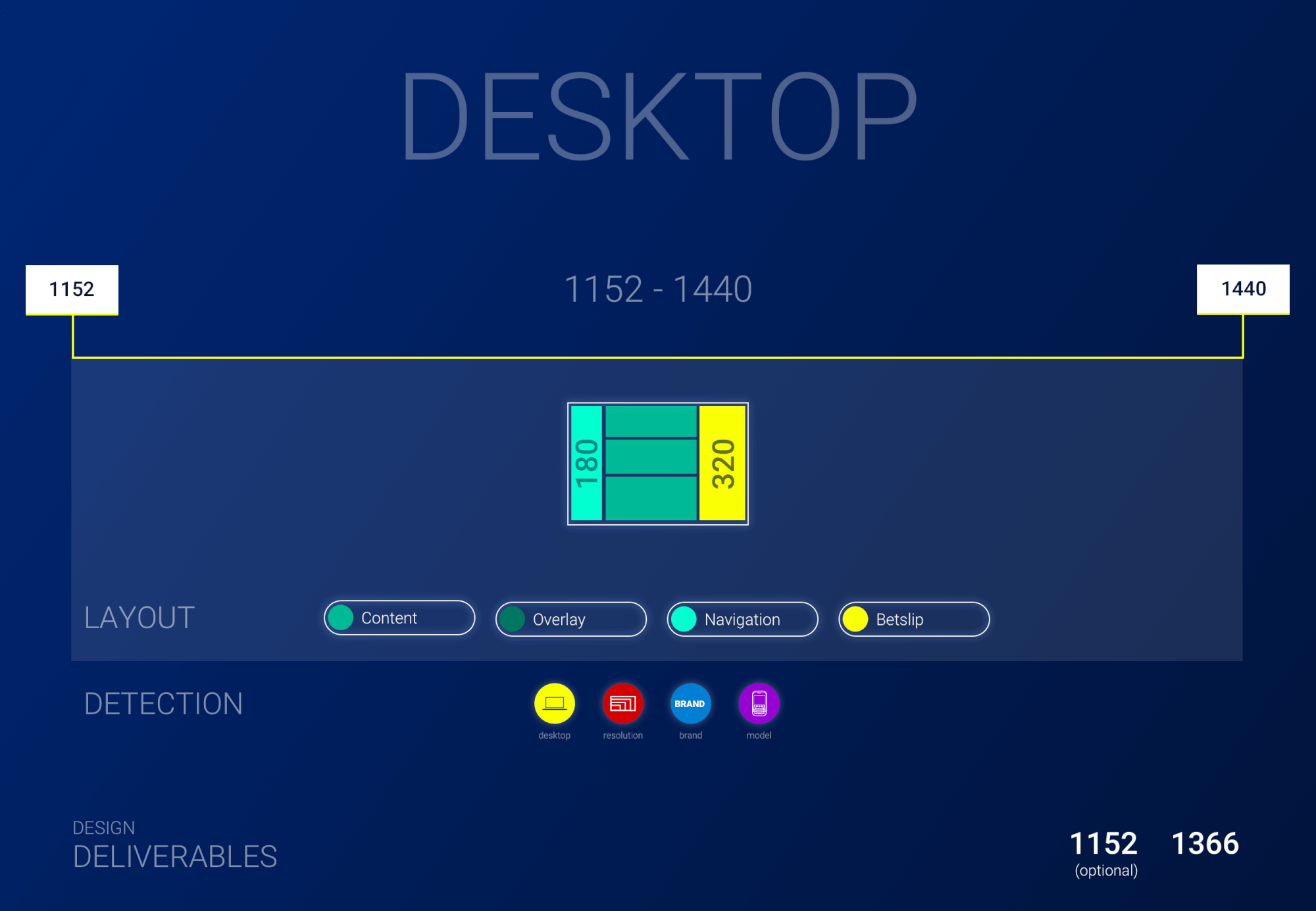

I also had to consider not only what we currently had on the site, but everything that was soon to be included. I had to learn a lot about betting on different sports and even the rules of the game so I’d know how to prioritize and group the information. Last but not least, consider the way users will scan for bets they want to place.
We managed to save a lot of space and improve the content density by having at least 3 more market templates above the fold which we had set as a goal and optimize the views across devices.

conclusion.
Working at William Hill gave me an amazing head start into doing things in a whole different way – collaborating with teams in a huge organization, spread across multiple locations, thriving in a multi-cultural environment, establishing work processes and building a design system, or rather pattern library, from scratch, and even surviving a rebrand. Not to mention unforgettable experiences and interesting people I met along the way who were with me through this journey.