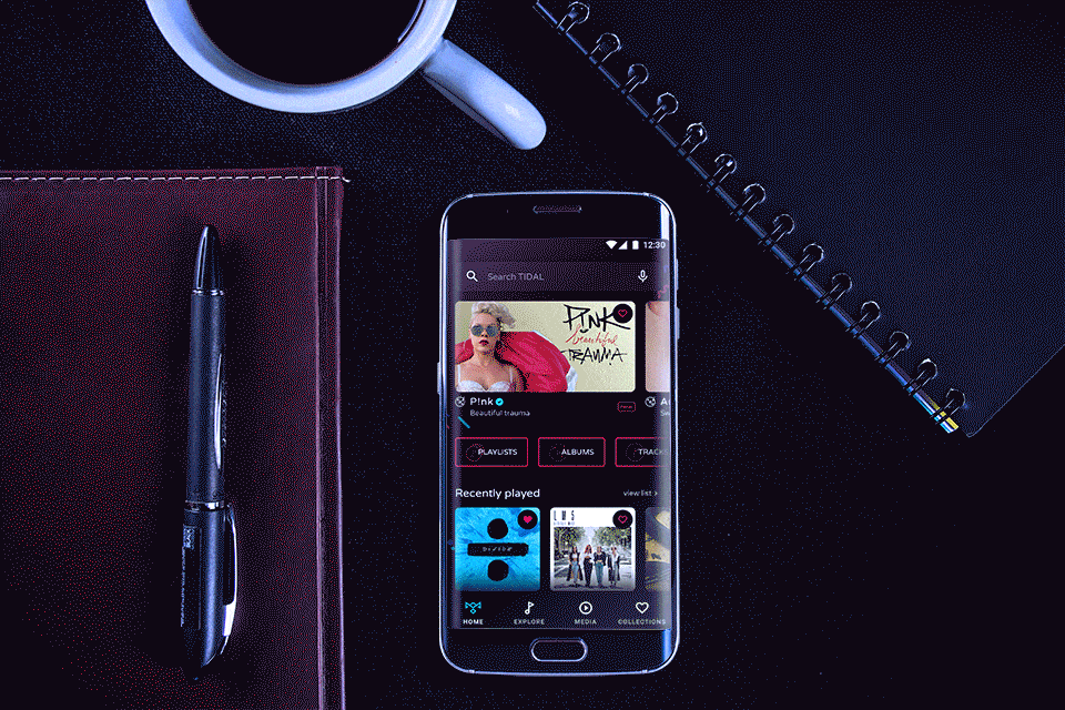
What is TIDAL?
Tidal (stylized as TIDAL) is a subscription-based music streaming service that combines lossless audio and high-definition music videos with exclusive content and special features on music. The service is maintained by the Norwegian company Aspiro AB.
The service has over 48.5 million tracks and 175,000 music videos. Tidal claims to pay the highest percentage of royalties to music artists and songwriters within the music streaming market, while offering two levels of digital music streaming service: Tidal Premium (lossy quality) and Tidal HiFi (lossless CD quality – FLAC-based 16-Bit/44.1 kHz – and MQA). Tidal was launched in 2014 by Norwegian public company Aspiro. It has distribution agreements with all of the three major labels, in addition to many indies.
Tidal reimagined
Personas & user goals
Age: 30-35
Device usage: 90% Android 10% Macbook
Collection: >2,000 songs
App usage: >5 hours daily
Needs: Quick and easy search + Quick access to my collections + Discovering new music
Often I just listen to whatever is new. Just as often I create collections and favorite songs/albums/artists that I like.
When using the app often on the move or in the car.
Create collections of your favorite music and listen repeatedly
Quick and easy search
Easy Favouriting
Creating collections
Explore
New music
Explore recommendations
Easily favorite new music
Socialize with friends
Share songs or collections
Co-own collections with other users

Suggested items are so spread out that they are hard to find. There is so much information on the homepage that there is barely any left for Exploring.
Main Issues
Some sections like Home have a lot of subsections while others are quite bare
Explore section is quite poor
Customize experience based on user’s habits
Everything is visually the same and need to constantly read titles quite carefully
More than one-click away
Create visual hierarchy and differentiation between sections and different types of info,e.g. Rising, album,playlist, track.
Sometimes the user has to drill down too much to get to something
Search is hard to get to and confusing

User Experience Map: Locate and listen to music in My Collections
User Experience Map: Search for tracks
Customer pain point.
Home section is overflooded and content is quite spread
Opportunity: Move more content to Explore. The home screen can be a hub and a 50/50 between my content and other content, while Explore section is where suggestions and New music lives
Explore section is quite bare
Opportunity: Grow the Explore section – add suggestions, new music, rising stars, etc. Differentiate visually between the multiple types of content
Redesign & revised IA.
Based on the research done so far and my persona(l usage), I will propose a few improvements on the user experience, improving user flows, addressing pain points as well as adding my own touch to the visual design.
Explore section truly becomes the place to explore new music, suggested music, featured content. Home becomes more personalized and related to the user with suggested new music as well as recently played items and favorited content. My collections section is restructured to become more user-friendly and to provide quicker access to favorite content. Media now hosts anything that is not a track, album, etc per se – videos (can be music videos, interviews), podcasts and concert info. These, however, will be present on an artist profile.
